the people’s temple rebranding
branding
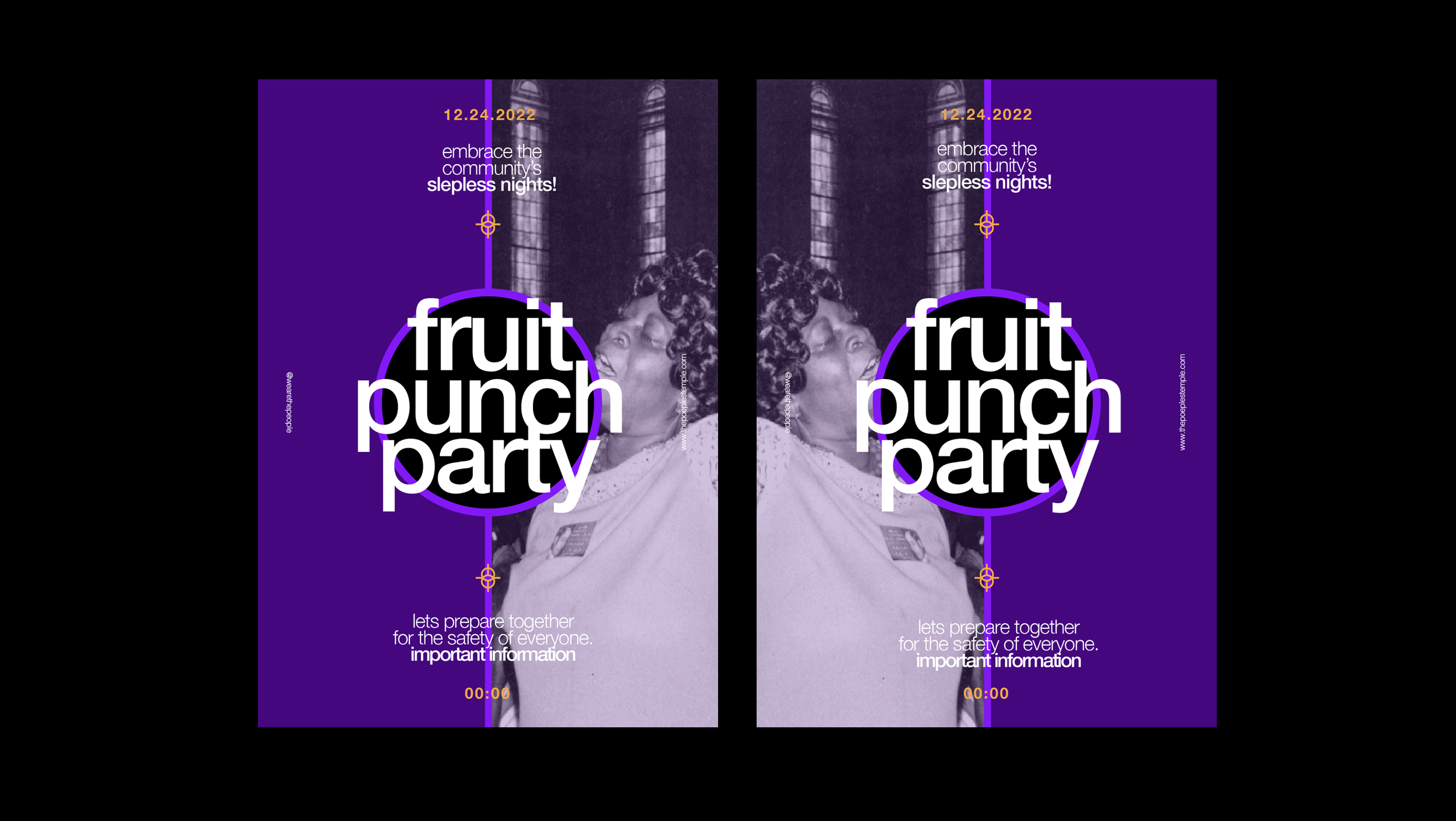
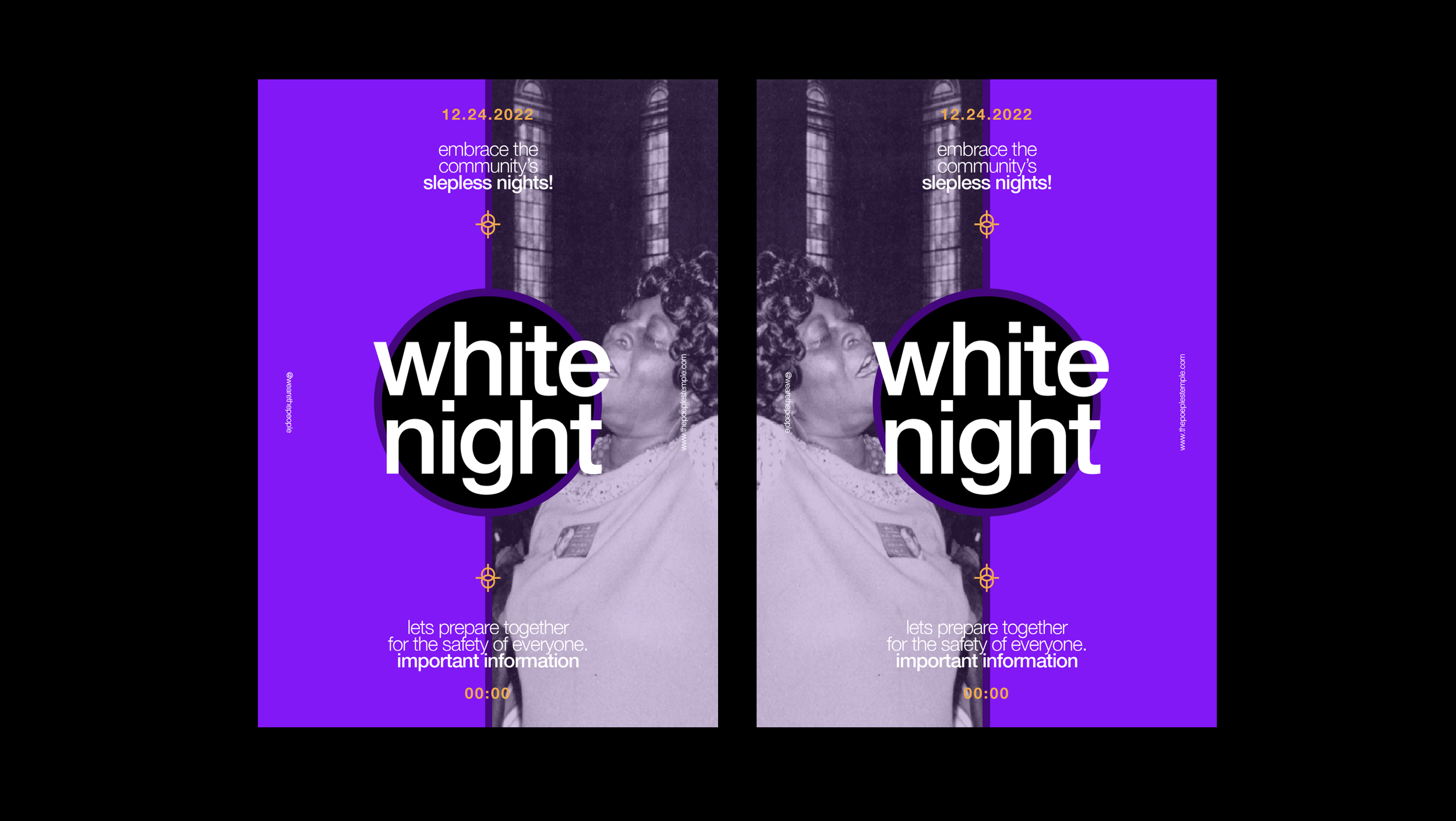
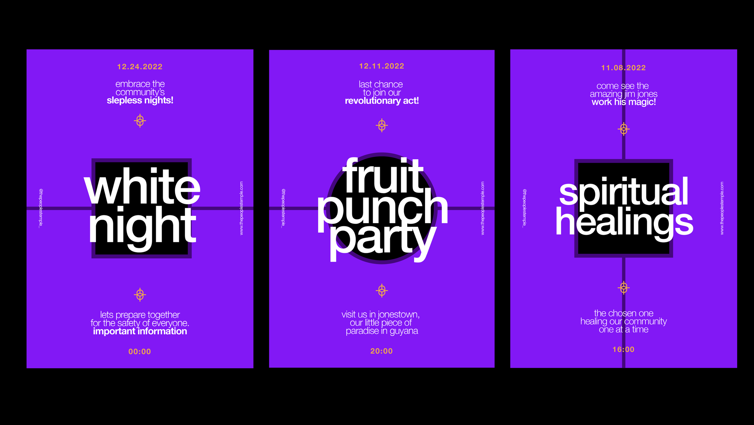
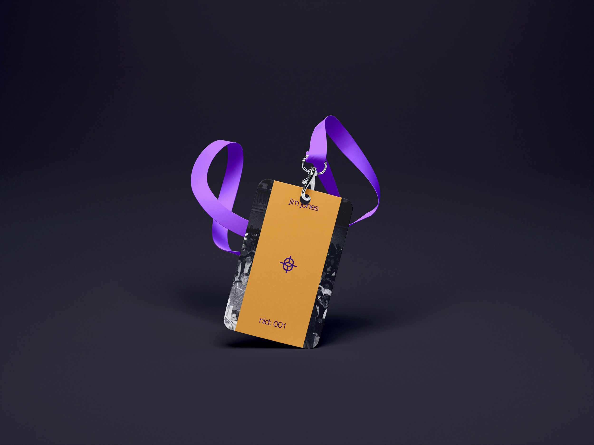
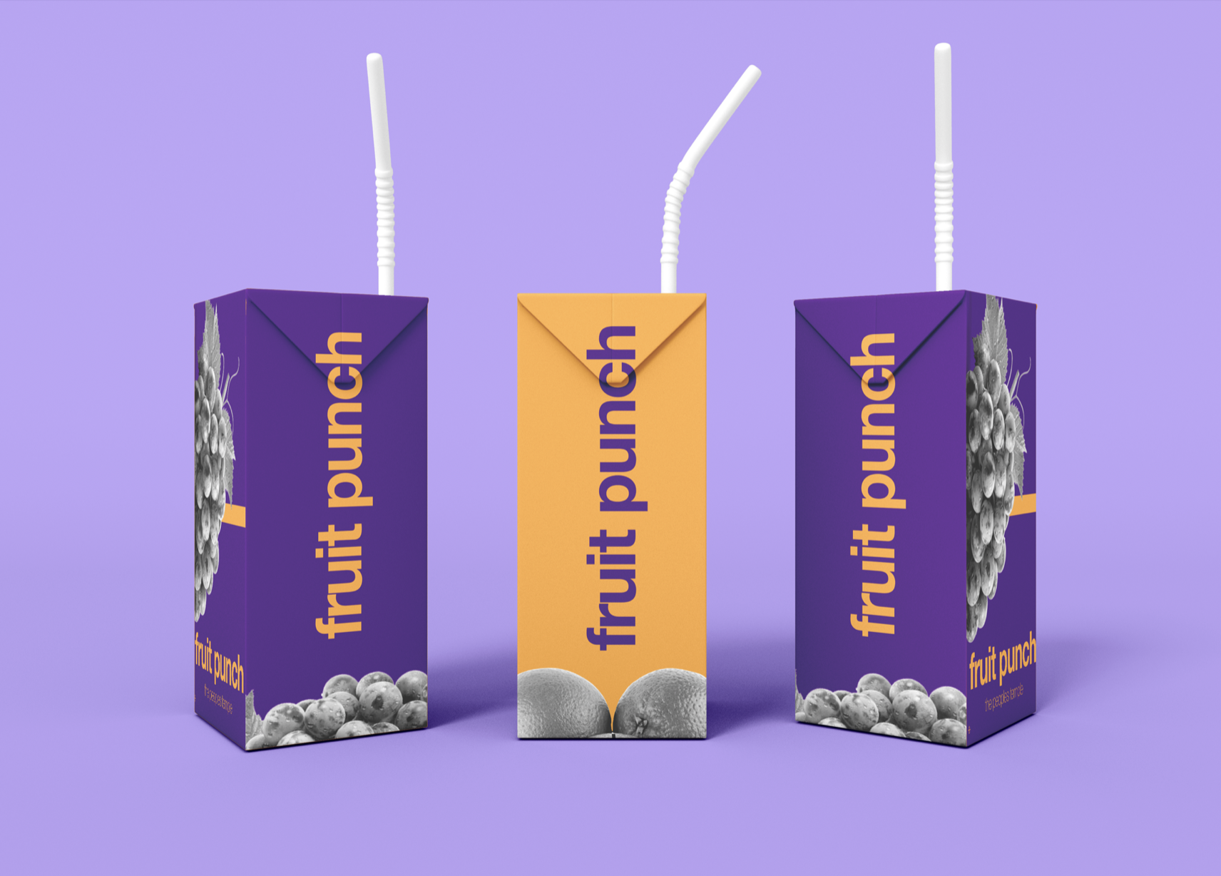
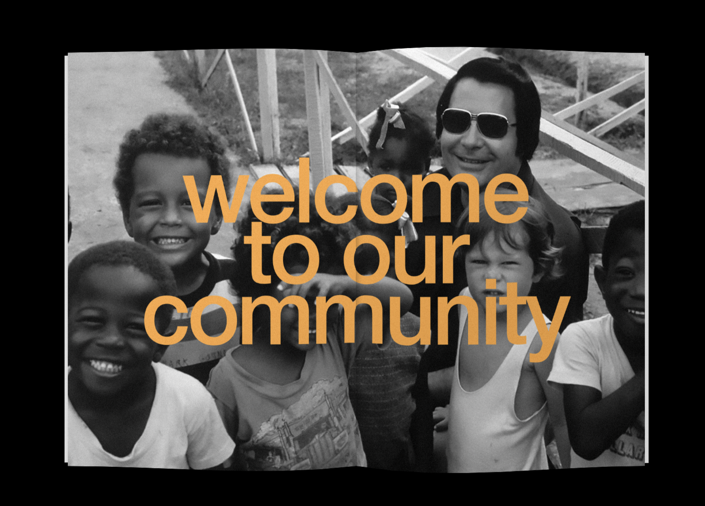
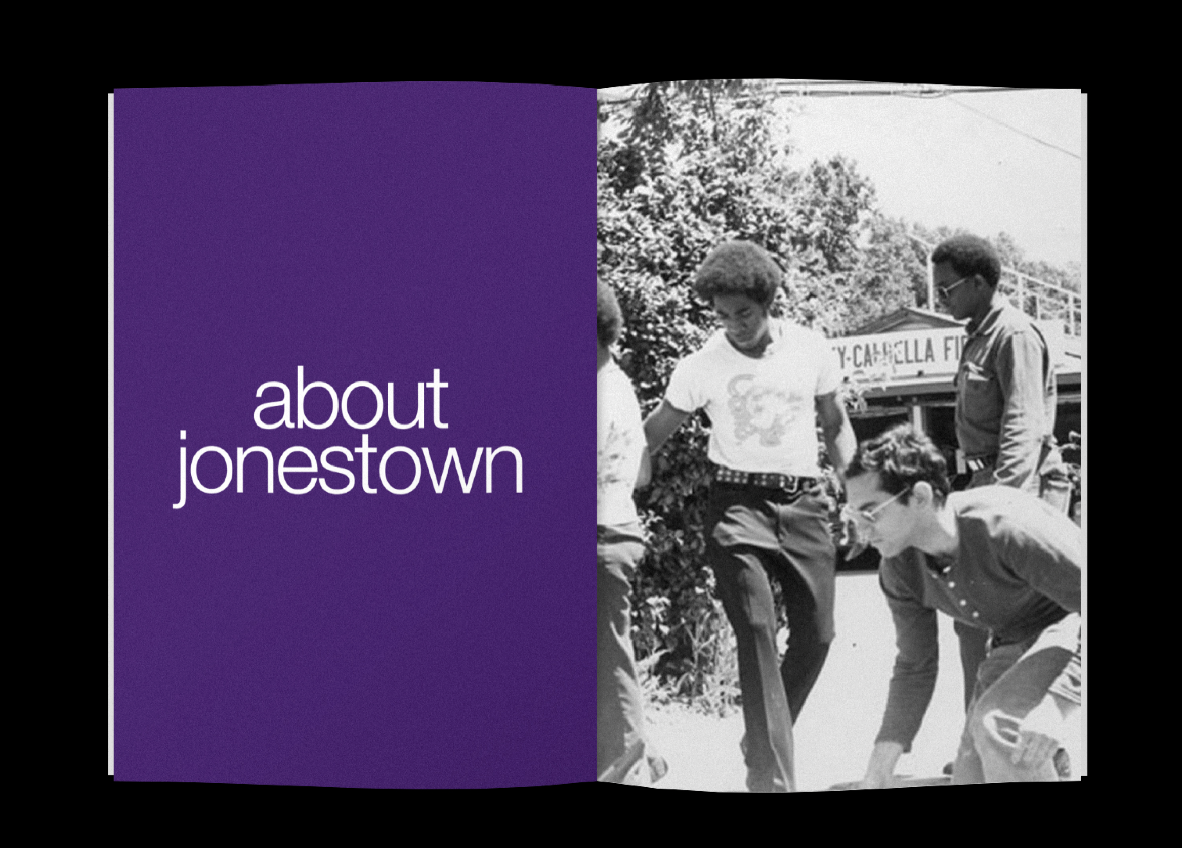
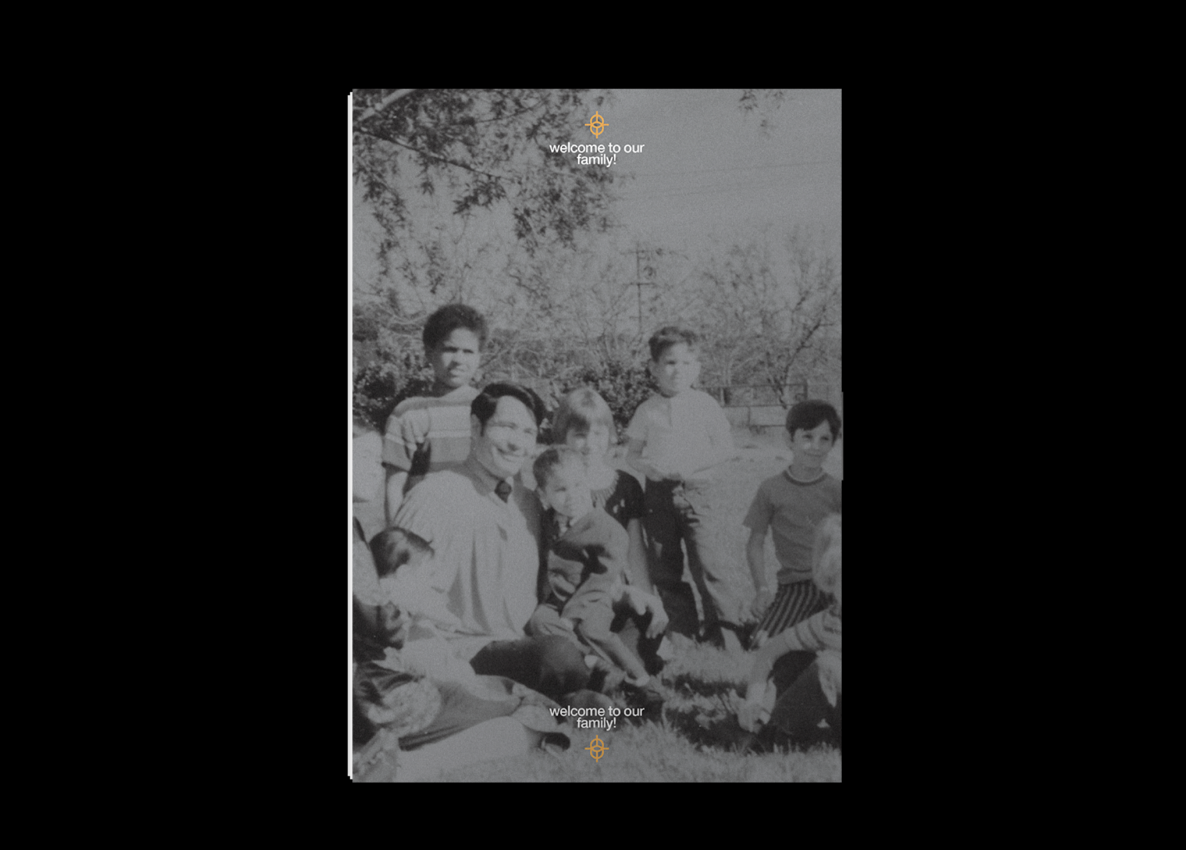
“The People’s Temple” project consisted on rebranding a cult. The first step was conducting thorough research about the history and values that defined the cult and made them different from other ones. From this research phase we extracted three key terms that would guide our project. These words were balance, symmetry, and working together. The rest of the design decisions for this project were based on the themes identified during the research phase. The colour scheme, image style, logo and items we designed were all influenced by the history, and the values extracted from the research of the cult.